A heuristic evaluation was conducted on Meetingmap.com, an online AI tool that attends, transcribes, and summarizes online meetings. From the core findings of the heuristic evaluation, research questions were formed and a usability study was conducted. Lastly, recommended fixes and solutions were provided for a select number of findings. 
Timeline: September 2023 - December 2023
Team: Liya Thomas, Margaret Ricotta, Erin Ansari, Alec Bielanos
My Role: Heuristic Evaluation, Usability Testing, UX Research, Moderator, Analyzing Data
Heuristic Evaluation 

Purpose
The purpose of conducting this heuristic evaluation was to identify usability and accessibility issues within meetingmap.com. Usability and accessibility heuristics were used to focus on the core functionalities of the desktop version of Meetingmap.com. The evaluation prioritized issues according to Meetingmap business and user objectives.

Stakeholders: 
End-users: These are the individuals and businesses that directly use Meetingmap. They include professionals, students, and organizations seeking to streamline their digital interactions and extract key insights from their online meetings and content. ​​​​​​​
Top Findings: 
A total of 41 Heuristic issues were identified. Below are some of the findings that directly pertain to specific Meetingmap business and user objectives. 
Objective 1: Design an interface that promotes AI-first interaction.
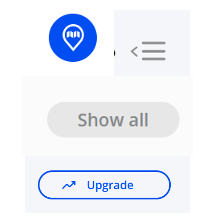
• External Consistency: The “Ask iClerk” icon looks similar to icons typically used to depict map pins or location features (Figure 1). Because of this, users can become confused about the purpose these buttons serve.​​​​​​​

Figure 1: The “Ask iClerk” icon (left) compared to a standard map pin icon (right)

Objective 2: Highlight and organize important parts of user meetings.
• Perceptibility of System State: The user can connect multiple calendars from both Google and Outlook to the service. However, the terminology “connect your Google/Outlook Calendar” (singular) implies only one of each can be connected (Figure 2).​​​​​​​

Figure 2: The interface to connect calendars
Objective 3: Create a product that is accessible and usable by individuals with many types of disabilities.
• Internal Consistency: The styles of controls (such as buttons) on the website are slightly inconsistent in that users’ behaviors and actions toward these buttons (all used for some type of navigation) should be the same; internal consistency calls for buttons that perform similar actions to appear similar throughout the site. Examples are included in Figure 3.
• Accessibility Principle 1: Perceivable: (1.4.1) Insufficient text color contrast in several areas (Figure 4 shows 2 examples). The contrast ratio between text and its background must be 3:1 for large text and 4.5:1 for small text. “Large Text” is defined as 18pt normal weight, 14pt bold weight, or larger. Users with visual impairments (such as color blindness) will not be able to read some text on the website.
Figure 3: Several examples of different buttons used throughout the site
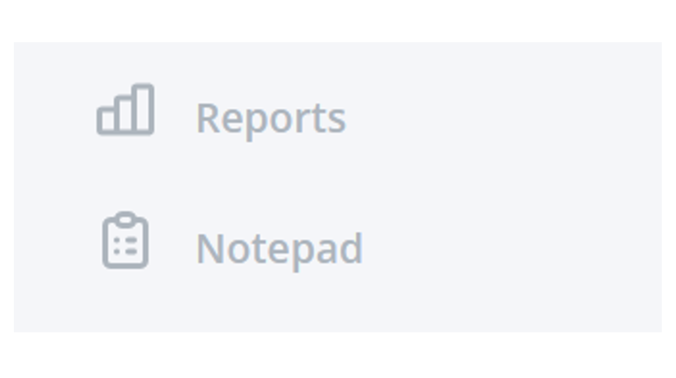
Figure 4: An example of insufficient color contrast between text and the background
Objective 4: Create a polished, robust product that is both appealing to users and competitive with similar products.
• Error Recovery: The “Something Went Wrong” page (Figure 5) does not describe any steps to the user for error recovery. The user has no way of knowing what has happened, or if something they did was wrong, and if they can do something different to fix it.

Figure 5: A “Something went wrong” error message is shown

Usability Testing

Research Questions:
Research questions were crafted to align with the issues identified in the heuristic evaluation and based on client feedback
1. Calendar Integration: Can the participants connect and access information on their calendars (Microsoft Outlook or Google) from within Meetingmap?

2. iClerk Chat feature: How do participants rate their satisfaction with the responses that Meetingmap’s chatbot feature provides to their meeting-related questions?

3. Ease-of-use of Core Functionality: What are participant questions, reactions, and feedback surrounding the ease-of-use of core Meetingmap functionality (as defined by Meetingmap), namely: Inviting iClerk to a meeting, uploading content to be analyzed, and creating a short video? 

Methodology: 
The research questions and the heuristic evaluation results were used to pinpoint four participant workflows within Meetingmap to be tested
1. Connecting a participant’s calendar to Meetingmap and locating meetings on the calendar

2. Using iClerk’s chatbot feature to summarize and extract specific information from existing recordings of meetings

3. Inviting iClerk to participate in a meeting with an existing link

4. Creating a “short” video from an existing recording of a meeting
Evaluation Environment: 
Each test session was carried out via a Zoom video conference between two researchers from RIT (one moderator and one recorder) and the participant. All participants were required to share their screen and open a new browser window (Figure 6). During the test sessions, iClerk was invited to each session as a participant, which generated audiovisual recordings and transcripts through Meetingmap. As an additional failsafe, the meetings were also recorded directly on Zoom.

Figure 6: Screenshot from a Zoom Testing Session. The participant is sharing their screen with Meetingmap while the RIT Team moderates the test and observes participants' interactions.

Participants: 
A total of 11 participants took part in the usability testing including 1 pilot participant. The participants all fit within the inclusion and exclusion criteria. 
Inclusion Criteria:
- Must be 18+ years of age.
- Must have familiarity with attending meetings with Zoom or Microsoft Teams
- Must have an online calendar through Google or Microsoft Outlook


Exclusion Criteria:
- People who have experience with Meetingmap
- People who do not have meetings frequently (weekly or daily).
- Software Engineers and Developers
- Usability Evaluators
- Computing and HCI Professors or Students
Additionally, individuals of varying genders, ages, experiences, and professions were reached out to ensure the participants fully represented all participant characteristics (Figure 7).

Figure 7: Participant Characteristics *The pilot participant can fall into any of the above demographic categories.

Scenarios and Tasks: 
Participants were given the following scenarios in counterbalanced orders, as seen in Figure 8, to prevent the influence of task order on subsequent tasks.
Scenario A: Calendar Connection
Objective: Starting from the Meetingmap homepage, participants should be able to connect one of their calendars to the Meetingmap service and finally locate an area on the site where they can view their meetings.

Scenario B: Using iClerk to Gather Information
Objective: Given login credentials to a participant account containing an existing recording of a meeting that has been processed by Meetingmap, participants should be able to engage in a conversation with iClerk, prompting it to find a specific sentence that was said in a meeting based on a rough description of the quote, and generate a summary of the entire meeting.

Scenario C: Inviting iClerk to a Meeting
Objective: Given a URL to a meeting, the participant should be able to invite iClerk to a meeting.

Scenario D: Creating a Short from an Existing Meeting
Objective: The participant should be able to create a Short (brief segment extracted from a longer meeting recording) from an existing meeting.

Figure 8: Participant Scenario Order

Results and Findings 

General Findings: 
A majority of the participants interacted with the iClerk chat feature when they were stuck or confused when we asked them to accomplish a scenario task. Some participants expected iClerk to have the ability to perform some tasks such as connecting a calendar and creating a short version of a meeting.
The chart (Figure 9) summarizes the overall sentiments reported by participants to the first four questions of the post-test Likert questionnaire.

Figure 9: Breakdown of Likert responses from the general category of the post-test questionnaire.

Results by Scenario: 
Scenario A: Connecting Calendars to Meetingmap
Quantitative Results: 
Completion Rate: 100% 
Median Time to Complete: 41 seconds
Interquartile Range: 33 to 58 seconds
Qualitative Findings: 
Most participants easily and quickly located and connected the calendar to meetingmap.com. One participant struggled to find the meeting in their calendar. They said out loud “Hmm to find a meeting. If I'm assigned a meeting. I'm guessing I'm gonna start with Calendar?” When he could not visually spot the meeting in the calendar after visually looking at the calendar for over a minute, he then went to the iClerk and prompted it with “Find a meeting with the word Quarterly Performance Meeting.”

Figure 10: A breakdown of Likert responses for Scenario A (Connecting a Calendar to Meetingmap)

Scenario B: Using iClerk to Obtain Information
Quantitative Results: 
Completion Rate: 100%
Median Time to Complete: 2 minutes 17 seconds
Interquartile Range: 1 minute 45 seconds to 2 minutes 25 seconds
Qualitative Findings: 
One participant was excited and impressed by the results of prompting the iClerk to complete the task during the meeting. Upon receiving the results, they said “Wow! Alright! Just in the first place, I'm impressed just by that.” Participants did ask frequently if they were done with tasks. Multiple participants asked, “Is that it, am I done?” Many of them were not confident that they completed the task. For example, one participant asked iClerk to summarize a meeting and when the summary was displayed, the participant responded “Ok, that’s it?”

Figure 11: A breakdown of Likert responses for Scenario B (Asking iClerk for Information)

Scenario C: Inviting iClerk to Meetings
Quantitative Results: 
Completion Rate: 60% 
Median Time to Complete: 34 seconds
Interquartile Range: 31.5 to 41 seconds
Qualitative Findings: The results of this task may have been skewed due to a website bug that cut off a portion of the participant’s screen. The “Invite iClerk” button was cut off at the top right corner of the screen. The inability to properly read or click on this button led to some of the participants being unable to complete the task of inviting iClerk to a meeting.

Figure 12: A breakdown of Likert responses for Scenario C (Inviting iClerk to a Meeting)

Scenario D: Creating a Short from an Existing Meeting
Quantitative Results: 
Completion Rate: 70%
Median Time to Complete: 2 minutes 41 seconds
Interquartile Range: 1 minute 53.5 seconds to 3 minutes 24 seconds
Qualitative Findings:
Some participants scrolled throughout the website looking on how to create a short video and had some difficulties in finding the short creation, whereas one participant easily found it almost immediately “I just see the create short button. So I'll just click that.” At the time of the testing, the “Create Short Video” button did not have any text.

Figure 13: A breakdown of Likert responses for Scenario D (Creating a “Short” Video)

Recommendations 

Initiating Workflows:

Testing revealed several points where participants frequently got stuck while completing tasks. This problem occurred most often when participants searched for something they were unfamiliar with. In contrast, they had no trouble finding buttons labeled with text. Issues arose when user interface elements did not behave as expected, such as not matching previous experiences with similar applications. To address this, the design of features on meetingmap.com should be externally consistent with expected user interface interactions.
Enhancing iClerk:

During testing, participants often turned to iClerk for help or to complete tasks when they were stuck. They assumed the chatbot had more functionality than it did, possibly because iClerk looks like a search bar commonly found on other websites. This lack of external consistency led users to expect the chatbot to assist them in finding different elements within Meetingmap or directing them to where they could complete tasks. However, iClerk is not equipped to handle such requests, which can result in error messages and unhelpful information for the user.
​​​​​​​
Participants often tried to complete tasks without using iClerk, even when instructed to do so, as they didn't immediately notice the iClerk bar at the top of the screen. Difficulty in finding or noticing iClerk was attributed to a lack of perceptible feedback. Unlike other icons, the iClerk search bar lacked a pop-up bubble explaining its purpose. A suggestion is to have a chat bubble pop-up when users hover over the search bar, explaining how to use iClerk and its capabilities. This way, users exploring the page can learn about iClerk and are more likely to use it.
Back to Top